POLIMI'S ONLINE SERVICES
2019
UX / UI design
In the framework of the course Interactive System Usability Design, me and my team mates redesigned the landing page and secondary pages of Polimi's Online Services, in order to better meet the needs of students and professors. I took care of the overall website analysis and UX definition.
Current website
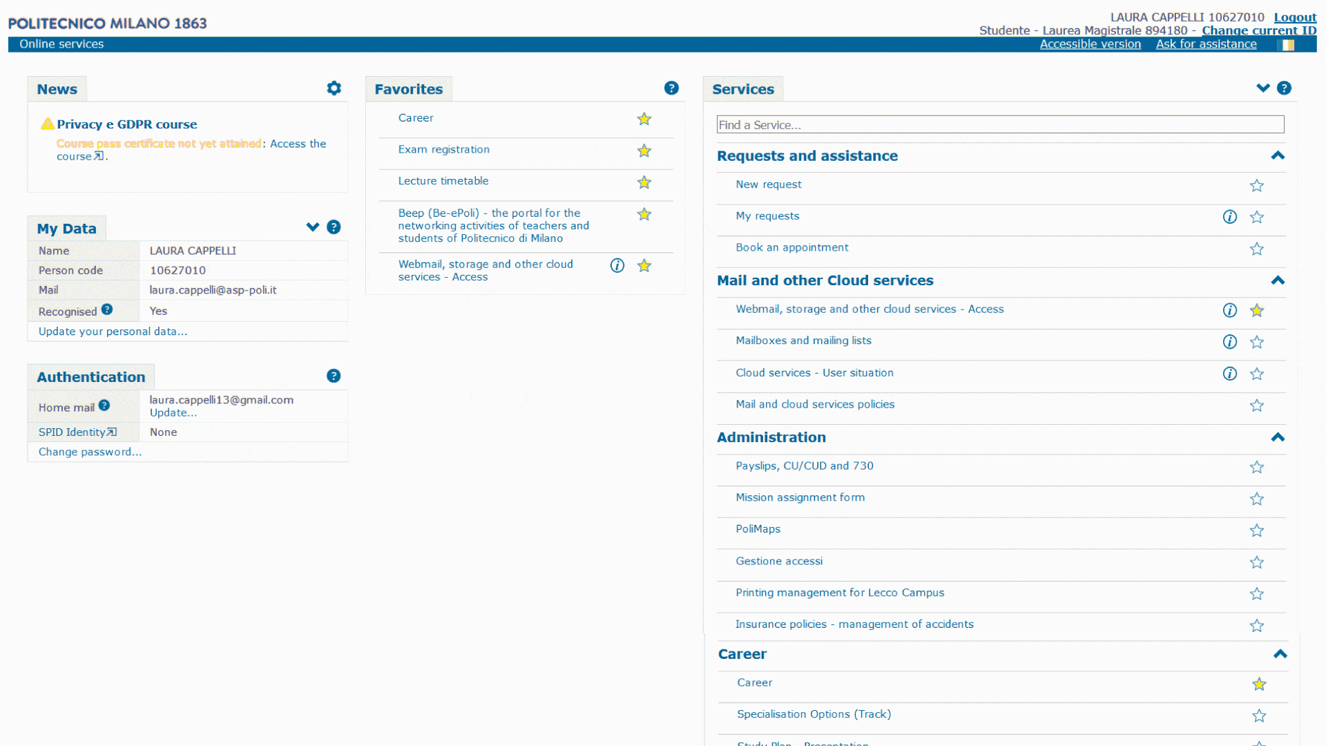
The first step we took was analyzing the main issues of the current website: first of all, together with the presence of too much blank space, we noticed how the links are ordered in a way that’s counterproductive for a student, as the more used functions are the last. Plus, there is no content hierarchy, as all the links have the same visual importance; lastly, the taxonomy is not clear, so it’s difficult to find the right piece of information
User analysis
As students, we gather our opinions about the Online Services and its positive and negative aspects. We then proceeded to interview other categories of students and gathered the research results in 4 personas.


Graphical coherence
Areas of intervention
We tried to intervene on the graphic consistency of the external links (like mail and Career Service) and secondary pages, that right now are different from the homepage
Language
Information architecture
We rearranged the way information is displayed in order to better meet the users’ needs, since in the current website there's no proper content hierarchy, and the most used functions are not properly placed
We changed how some functions
were addressed, using simpler and
clearer words than the ones used
now, since now our users found some issues in completing simple tasks
New architecture and language

In rearranging the information architecture, we started by writing each link in the Online Services on post-it notes, in order to visually order them.
We found ourselves eliminating some functions that, from our student perspective, are completely useless to have.


In redefining the architecture we deleted all the information that should not be placed in the private area of students’ portal, but that could be moved on the general public website, like:
-Printing management for Lecco Campus
-Information about Polimi’s apps
-Other information about ICT and web infrastructure
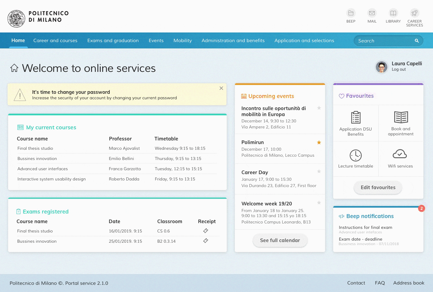
Redesign
We then proceeded to define the features of the new interface: the final effect we wanted to obtain was that of a dashboard, on which the user can monitor all the most important information about his/her career, future deliverables and events, degrees...